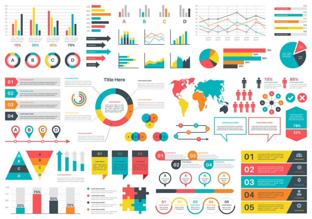
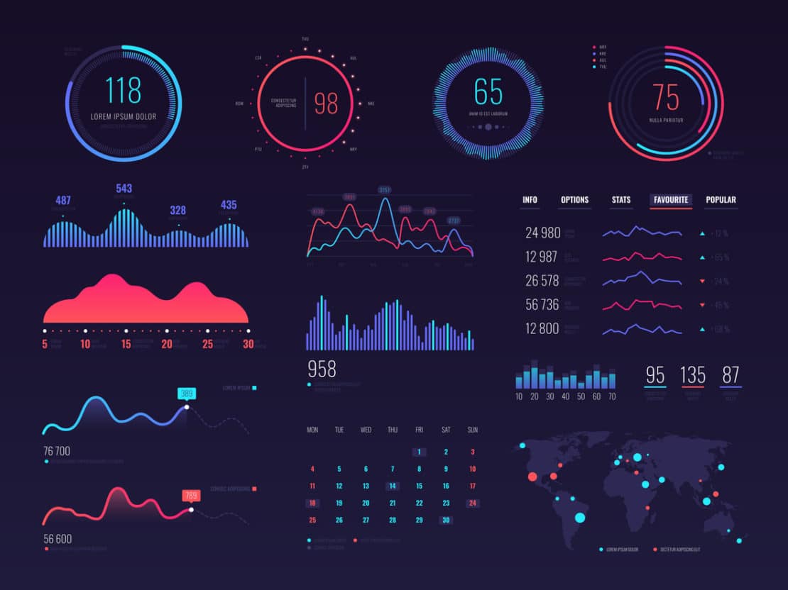
The Data Visualisation Tools that Software Marketers Need to Know About
Harnessing data is a powerful way to elevate your content and drive clicks and traffic to your site. But extracting stories from data isn’t easy – especially when you’re dealing with large data sets that appear virtually indecipherable. That’s where data visualisation tools can help.
Like the name suggests, data visualisation tools automate the process of turning data into visuals. Based on pre-defined parameters, they extract stats and figures from your data sets, creating charts, maps and graphs which then facilitate effective, data-driven storytelling.
Here, we provide an introductory guide to data visualisation, explaining what it is and how it can be used, and some of the tools you can use to create visuals from data.
What is data visualisation?
Data visualisation is the process of translating data into a visual, making it easier to read and understand. It’s a way of making complex data more accessible while highlighting key points.
That’s because shapes, images, colours and charts are easier for us to understand than a spreadsheet or database. By presenting data visually, it gives a much clearer picture of what a piece of content is trying to say – which increases engagement and improves the user experience.
From a marketer’s perspective, data visualisation is an effective way to marry raw data with visual content. Its application is useful in all sorts of marketing-related scenarios, from the creation of internal Google Analytics reports to the publication and outreach of information that’d usually be complex and inaccessible.
With all that data at our fingertips, finding creative ways to turn complex data sets into compelling visual stories has become a go-to tactic for content marketers. Provided the information is unique and of interest, any data can be extracted, refined and visually presented as a way of winning clicks, shares and traffic off the back of your content.
Why data visualisation is important
Presenting data visually is important for a range of different reasons, including:
- Telling a new story – data can be tirelessly extracted to present new stories and angles to your readership.
- Faster communication – time is precious in the digital sphere, so visual data helps to get your content seen faster. Digestible data visuals are perfect for social media sharing, presenting a story in a scannable, easy-to-digest form.
- Understanding connections – pulling data from a set can highlight new patterns and trends which you may otherwise not have noticed, so it’s a great way to bolster your campaign strategy.
- Backing up your content – no one can argue with data, so visuals are a great accompaniment to content which is trying to get a serious point across.
- Creating new discussions – data can be a force for change and the catalyst for new discussion and ways of thinking. Presenting it visually will increase the impact and increase engagement.
What are data visualisation tools?
Data visualisation tools help marketers present data visually. Since content marketing has become a huge part of organic search optimisation, several platforms have emerged which allow you to quickly turn data into visuals – a simple way to create data-driven content that can increase engagement and traffic to your site.
Dealing with large data sets can be a tricky, if not impossible task. When you want to find unique stories in your data or highlight the standout stats and figures, it’s often not possible or feasible to do this manually – which is where data visualisation tools come in.
By automating the process of extracting noteworthy data from complex, often indecipherable sets, data visualisation tools practically do your job for you. And even if you opt for a process which is only semi-automated, it becomes much easier to handle, analyse and extract the data when using the right data visualisation tool.
But which tools should you be using? And what benefits do they offer? Find out below.

The best data visualisation tools for marketers
With thousands of tools and applications promising to transform your data into visuals, how do you go about choosing the best platform for the job? Well, while at a basic level there’s overlap between the functionality of some tools, there are also applications whose features and interface make them stand out from the rest.
Here, we take a look at 5 of the best data visualisation tools and the benefits they offer.
Looker Studio
Formerly known as Google Data Studio, this browser-based analytics and visualisation platform makes for easily shareable reports and dashboards – and of course, it can be integrated with other Google Products like Sheets and Analytics too. It’s easy to use as well, letting users create a variety of interactive visualisations and models with very little knowledge of SQL.
Benefits:
- User-friendly setup and navigation
- Easy integration with Big Data platforms and databases
- Custom install options in addition to hosted solutions
Tableau
Tableau is one of the best-known data visualisers out there. With several significant improvements over the years, their platform offers a one-size-fits-all solution for multiple applications and disciplines. The tool’s strength lies in its huge wealth of import options, including CSV and Google Analytics data, which means you can automate and visualise just about any type of data set.
Benefits:
- Free public version is great for quick visuals to accompany site content
- In-built infographic and visualisation templates look premium and original
- Mapping feature is one of the best around, allowing for the creation of colour-coded maps to highlight geographic trends
Datawrapper
Datawrapper is designed for creating data-led visuals which can be embedded on news sites, blogs and social media – perfect for those focusing their efforts on a digital PR strategy. The premise is simple: copy and paste your data into the tool, choose the chart type you want, and the tool will do the rest, creating an embed code for you to share with media outlets or to post yourself. Visualisation options include bar charts, area charts, scatter plots, symbol maps and locator maps, so there’s plenty of option depending on the story you’re trying to tell.
Benefits:
- Quickly build data visuals that are suitable for widespread press coverage, and compatible with all major CMS systems
- Embed code makes it easy to share and distribute your charts, without the need to transfer large files
- Free plan is great value for small sites who do regular PR pitching and visual data creation

Power BI
Like the name suggests, Power BI is an excellent business intelligence tool that offers seamless integration with a plethora of Microsoft products – so it’s great for building data visualisations with. It’s excellent value too: even the free plan lets you connect with over 70 data sources to create rich, interactive reports with. There are plenty of charts that are initially available, but you can easily purchase more for a fair price too.
Benefits:
- Easily aggregates data from different resources, including marketing and sales services
- Cheaper tiers compared to other data visualisation tools
- Anyone experienced with Excel will be right at home with Power BI
Databox
With over 70 integration options, this extensive platform is tailored more towards advanced users, but it’s still easy to set up and use. That’s largely down to its drag-and-drop editor that makes building custom dashboards a breeze – though there are still 200 pre-existing dashboard templates for you to choose from.
Benefits:
- Easy integration with the likes of Salesforce, Google Analytics, Hubspot, Facebook Ads and more
- Great for companies specialising in digital
- Can easily present data through smartphones, Slack and Apple Watches
Key features marketers should look for in data visualisation tools
When it’s time to decide on a data visualisation tool, here’s what we’d recommend taking into consideration beforehand…
Integration
How well the tool can link with various data sources like spreadsheets, databases or cloud services is super important. Not only does it make the process importing data far simpler (and reduces the risk of manual errors), but real-time data updates mean your visualisations always stay current.
Interactivity
Data visualisation creates a lot of information, which can make things overwhelming for users. But interactivity makes the process of drilling down into data and finding what you’re looking for a whole lot less of a headache.
Customisation
Customisation is key for a number of reasons. First, it can help cater to visual preferences, allowing you to choose colours, fonts and layouts that match your own branding or, say, your audience’s inclinations. By amending your axis labels, legends and other elements, it’ll also help make your messages clearer too. And by highlighting key data points and trends, your visualisations can stand out and become much more memorable to those who need them.
Ease of use
Nobody wants to grapple with a complicated data visualisation tool. Something that’s user-friendly and easy to get used to is absolutely essential, allowing you to navigate and make sense of large amounts with minimal training. A real time saver, go for tools with a clean interface, simple menus and easy-to-understand icons that make the visualisation process easy.
What makes good data visualisation? Best practices in marketing
Tailored dashboards
A one-size-fits-all approach to your dashboards won’t work when you have so many marketing goals or specific campaigns on the go. There are just simply too many differentiators and moving parts. Instead, make sure you’re tailoring each of your dashboards to individual campaigns and channels for greater efficiency.
Clear, accurate visuals
The best visualisations are those that let the audience understand the insights quickly and clearly. Anything that’s overly complex will confuse your users, take time to digest and impact efficiency.
Keep things simple instead. Only highlight the relevant data points, take out anything that might distract users, and use the most effective visualisation for your data. Not sure what chart type is best for your data? Keep the below in mind…
- Line charts: For tracking changes or trends over time and showing the relationship between two or more variables
- Bar charts: To compare quantities of different categories
- Scatter plots: For showing the correlation between two variables plotted along parallel axes
- Bubble charts: For the same as above, but when there are three data items
Telling a story
Data usually has plenty to say, so it’s vital that it clearly speaks to a wider context when you present it – especially since you want people to act after they’ve had chance to make sense of it.
The best way to increase this action is to compare the data to something like a goal or historical results. This allows the audience to interpret the numbers more effectively, and where they might need to act after you’ve presented your story.
At BANC, our content marketing and digital PR specialists create visual, share-worthy content that drives traffic, links and clicks to your website. For more on about how we can take your organic search performance to the next level, visit the homepage or call us on 0345 459 0558.


